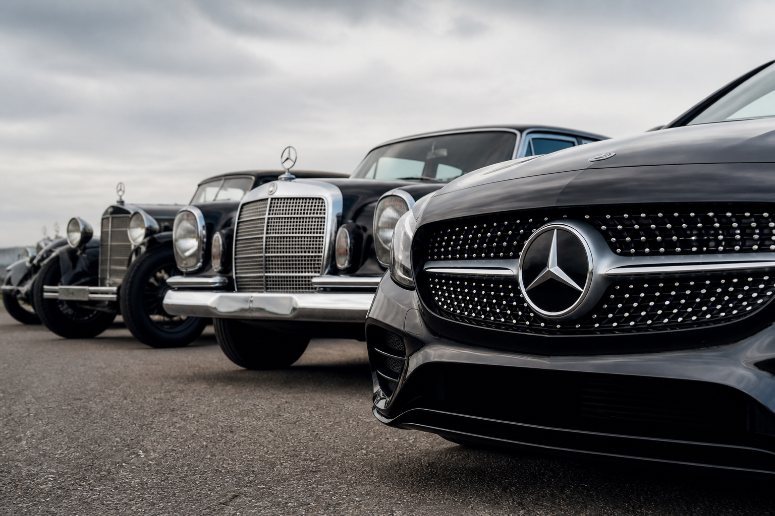
Mercedes-Benz standardizes its emblem by combining the three-pointed star with laurel elements and, later, wordmark into a single signet after the 1926 merger. This emblemical consolidation informs the brand’s front-end language, where the star and grille became signature cues that evolved from functional cooling components into a distinctive front fascia, ultimately influencing modern interpretations and the Black Panel concept seen in EQ designs.
Key takeaways
- The emblem’s consolidation (star + laurel/wordmark) occurred as part of the 1925–1926 merger that formed Mercedes-Benz.
- Grille design evolved from functional radiators to a brand-facing element, with the star often positioned centrally within the front end.
- Mature design language ties the historical emblem to modern front-end faces, including the conceptually minimal Black Panel styling for electric models.
Overview: From the 1926 merger to today’s front-end signature
The Mercedes-Benz emblem grew from a practical radiator symbol into a consolidated brand mark that unites star, laurel, and wordmark. After the 1926 merger that formed the modern Mercedes-Benz company, designers and marketers set about harmonizing elements from both pre-merger brands into a single signet. This consolidation did more than produce a badge; it created a shared visual language that would govern how the emblem and the front end relate to model lines, technology shifts, and consumer perception for decades. In practice, the star’s three-point configuration became the focal point, while the surrounding laurel and typographic cues were standardized to support legibility, hierarchy, and brand recognition across eras and markets.
Two linked threads drive the narrative: how the emblem was assembled from historical pieces, and how that emblem then anchored the front-end “face” that Mercedes-Benz vehicles wear across generations. The result is a design language that can adapt—without losing identity—whether on a traditional grille with chrome accents or a modern, sculpted surface with minimal chrome and, eventually, the Black Panel cues of electric models.
Emblem consolidation: star, laurel, and wordmark
In the early 1900s, the three-pointed star began as a radiator emblem for Mercedes cars, borrowed from the idea of marking the brand on the vehicle’s cooling system. As corporate identities merged (the historic DMG and Benz & Cie lineage), the need to avoid competing marks and to present a united brand led to a standardized emblem. The integration of the star with a laurel wreath—and later the careful inclusion of a wordmark—created a singular signet that signaled both heritage and modernity. This signet became a stable reference point for dealers, press materials, and consumer recognition, guiding subsequent grille and front-end decisions across model ranges and generational updates.
Key design implications of this consolidation include maintaining a dominant star mark as the centerpiece, ensuring the emblem remains legible at varying viewing distances, and coordinating surrounding elements so the signet reads consistently across different body colors, finishes, and grille treatments. The interplay between the star and a minimal surrounding ring or wreath has also influenced how the emblem interacts with chrome, blacked-out finishes, and digital presentation on screens and advertising. The emblem’s shaping logic—circular containment, vertical symmetry, and a restrained typographic halo—also helped define a predictable anchoring point for grille geometry, which in turn supported the rapid rollout of model-wide front-end cues across markets.
Radiator grille development as a brand language
Beyond the emblem itself, the grille became a critical component of Mercedes-Benz’s brand language. Early grilles focused on cooling performance and air flow, with variation primarily dictated by coachbuilders and body styles. Over time, the grille opening, its proportions, and the chrome framing evolved into a recognizably “Mercedes” front. In the mid-20th century, the grille began to serve as a visual anchor for a car’s character—sporty on some models and more formal on others—while still accommodating the central star or emblem position.
In the postwar period, designers increasingly treated the grille as a front-end “face.” The arrangement—grille height, the density of chrome bars, and the visibility of the emblem—helped communicate the vehicle’s personality. By the late 20th and early 21st centuries, Mercedes-Benz offered model-line specific grille interpretations, reinforcing a consistent brand identity while signaling different driving dynamics and luxury tiers. The design language matured toward sculptural, integrated forms where the grille interacts with the hood line, headlamps, and bumper to deliver a cohesive silhouette. In practice, a recognizable grille often carries a light signature that complements the star, ensuring the front end reads as a Mercedes at a glance from any angle or lighting condition.
The modern era introduced further differentiation, with the concept of a “Black Panel” aesthetic appearing in some electric models. These concepts place emphasis on minimal chrome, a central star in a high-contrast field, and a grille that may act more as a stylistic aperture than a traditional cooling intake. The result is a future-facing front end that remains recognizably Mercedes-Benz through the central emblem’s continued prominence and its relationship to the surrounding geometry. Importantly, real-world models reconcile these stylistic ideas with sensor placement, active grille shutters, and cooling needs, so the design remains as functional as it is iconic.
Linking the emblem to today’s front-end language
Across decades, the emblem and grille have developed a throughline: the star remains the focal point, while the surrounding elements—whether a wreath, ring, or wordmark—provide context and scale. This continuity allows the brand to evolve with technology and materials while preserving instant recognizability. In practice, the emblem is positioned to anchor the grille’s visual rhythm, with proportional rules that ensure the signet remains legible at typical viewing distances, from showroom displays to street photography and on-screen media. Designers also consider regional lighting, camera sensors, and procurement realities for chrome and enamel finishes when finalizing a front-end’s proportion and texture.
Today’s Mercedes-Benz front ends often feature sculpted grilles that blend into sleek, low-drag silhouettes. In electrified models and concept studies, a Black Panel or similarly simplified presentation places greater emphasis on the star itself, sometimes de-emphasizing surrounding chrome in favor of a high-contrast or dark field. Yet even in these cases, the emblem operates as the signal of brand identity, carrying the heritage of the 1926 consolidation into a contemporary design vocabulary that spans digital media, showroom graphics, and vehicle graphics alike. The grille’s detailing—air intakes, sensor housings, and precision line work—works in concert with the emblem to project both refinement and engineering prowess.
Practical considerations for designers and buyers
- Brand recognition versus stylistic risk: The emblem’s stability supports cross-generational recognition, but designers must balance iconic cues with fresh interpretations to signal model differentiation without diluting the core identity.
- Grille proportion and cueing: A consistent central star requires compatible grille proportions to avoid a crowded or insubstantial front end, especially as lighting, radar, and camera sensors become more integrated into the grille area.
- Finish and color considerations: Chrome, satin chrome, and dark finishes affect how the emblem reads in promotional imagery and real-world lighting; designers adjust surrounding trim to optimize contrast and legibility across colors and materials.
- Electrification and future concepts: As Mercedes-Benz advances electric architectures, the emblem remains constant while the grille presentation may become more stylized or simplified to improve aerodynamics and sensor packaging, preserving brand identity in new packaging.
In sum, the Mercedes-Benz emblem’s 1926 consolidation laid the groundwork for a front-end design language that has proven resilient through almost a century of automotive evolution. The star’s central position, the support of laurel and wordmark elements, and the evolving grille grammar together establish a recognizable identity that adapts to new materials, technologies, and design philosophies while remaining unmistakably Mercedes-Benz.
Contextual reflections for enthusiasts and historians
For observers tracing the design evolution, the signet’s consolidation provides a lens into broader corporate strategy: a move from product-specific branding toward a unified corporate face. The emblem’s endurance raises questions about how much change a brand can withstand before the core mark risks losing its distinctiveness. It also invites consideration of how grille language acts as a vehicle for signaling performance, luxury, or eco-consciousness without altering the emblem itself. Studying representative moments—early radiator markings, mid-century chrome-heavy grilles, and contemporary Black Panel variants—helps readers understand the negotiation between tradition and innovation in Mercedes-Benz styling philosophy.
Further reading and reference points
For a detailed account of the emblem’s origin and its post-merger consolidation, see Mercedes-Benz Group: The Birth of the Mercedes-Benz Signet; Evolution of the Radiator Grille. For a broader look at the logo’s history and its timeline, see MotorTrend’s feature on Mercedes-Benz logo history. Mercedes-Benz Group’s tradition pages and historical sections provide primary-source context for the branding sequence from early radiator emblems to the modern signet and front-end language.
Sources