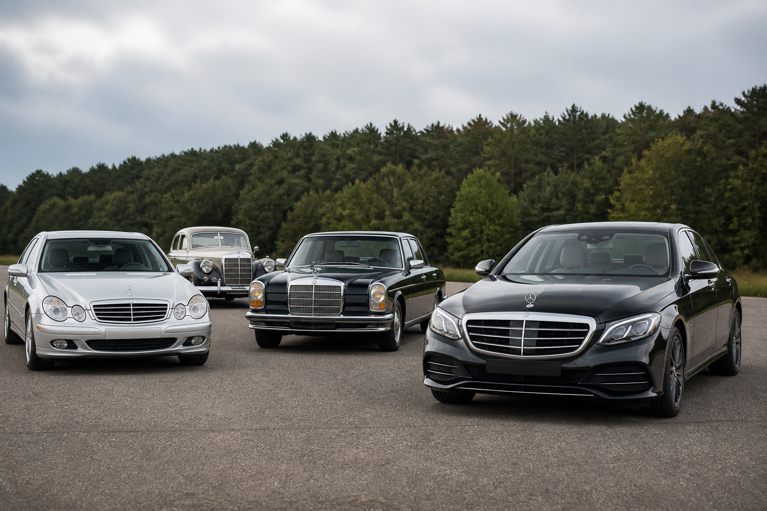
Mercedes-Benz formed a cohesive visual identity around two pillars: the three-pointed star (originating as a radiator emblem around 1910 and later unified with the Benz laurel in the 1920s) and a gradually evolved chrome radiator grille that became a central brand cue. The star’s integration within the grille and, in modern times, the EQ Black Panel styling, illustrate how recognition and aerodynamics shaped the front-end design while preserving historic symbolism.
Key takeaways
- The three-pointed star began on radiators around 1910 and later merged with the Benz laurel to form the Mercedes-Benz signet.
- The radiator grille evolved gradually, becoming one of the brand’s most recognizable features and adapting to aerodynamic and stylistic trends.
- Modern designs, including EQ styling, maintain star placement as part of a coherent front-end identity while updating proportions and finishes for contemporary look.
The Mercedes-Benz visual identity rests on two enduring design anchors: the three-pointed star and the radiator grille. This article expands the thread from the brand’s early emblem usage to the modern front-end language, showing how strategic choices in trademark unification, proportion, and finish created a recognizable look that adapts across eras and technologies. All points draw from verified source dossiers that trace origin, development, and current interpretation of the star-and-grille language.
Origins: the star as a radiator emblem and the groundwork for a unified signet
Historical Mercedes-Benz sources describe the three-pointed star as a personal emblem used on radiators starting around 1910. The early versions emphasized the star on the radiator face and occasionally on bonnet sides, without the surrounding ring that would come later. This practice established the star as a practical and legible brand mark at a time when radiator design communicated identity at first glance. In the 1920s, a pivotal legal and symbolic development occurred: Benz’s laurel emblem was merged with the Mercedes star to form a single signet. This unification created a formal, combinatorial identity that still underpins today’s Mercedes-Benz mark: the star, enclosed in a ring with the laurel heritage lending a sense of prestige and durability. The step from separate marks to a consolidated signet explains why the three-pointed star remains the most instantly recognizable element of the brand, with the laurels now serving as an undercurrent of heritage rather than a competing badge.
Source-backed narratives emphasize that the star’s initial radiatorial role and its later integration into a broader signet were not just cosmetic decisions; they reflected legal branding strategy and the need for a durable emblem that could translate across markets and printing processes. The evolution from radiator emblem to global signet paralleled Mercedes-Benz’s broader corporate identity program, ensuring consistency in branding materials, merchandise, and dealership communications.
Tracing the grille’s role: from chrome frame to a central brand cue
The radiator grille has long served as a visual anchor for Mercedes-Benz’s front end. Mercedes-Benz Group outlines a deliberate, incremental refinement of the chrome grille as a design cue that signals brand presence while accommodating evolving engineering and aerodynamics. Over decades, grille proportions—its width, height, and the relationship to the emblem’s central placement—have been tuned to maintain recognition as styling languages shifted from the pre-war era through postwar modernism and into today’s technology-forward lines. The star’s position relative to the grille remains a constant reference point that helps drivers and pedestrians quickly identify the brand, even as grille detailing changes with chrome, matte finishes, or more integrated, closed-form grilles in modern models.
In the modern era, the front-end language explores new expressions of presence without sacrificing recognizability. The EQ family, for instance, utilizes a performance-oriented interpretation of the “Black Panel” concept, where the grille-like surface and lighting elements create a strong face for the electric lineup while subtly integrating the star as part of a broader, cohesive front-end silhouette. These newer executions show how a single brand cue—the grille—can be reimagined to suit propulsion and sensor technologies, while keeping the star as the unifying symbol across decades.
MotorTrend’s timeline-focused piece on the logo history aligns with the manufacturer’s account, highlighting the staged consolidation of the star and laurel into a single signet and describing how the modern emblem evolved from those earlier iterations. This convergence underscores the grille’s continuity as a recognizable element that partners with the signet to deliver a stable visual identity across generations and design languages.
How design choices support recognition, aerodynamics, and modern branding crises
Key design decisions in the star-and-grille language hinge on balancing recognition with evolving aesthetic and aerodynamic requirements. The three-pointed star, symbolizing land, sea, and air, provides a simple, legible motif that remains legible at varying distances and resolutions—crucial for signage, print, and vehicle badges. The grille’s proportioning—width-to-height ratio, the degree of chrome or finished surfaces, and the star’s exact centering—has been adjusted to maintain the enduring front-end silhouette even as headlights, fog lamps, and sensors change the front fascia layout.
Contemporary interpretation often substitutes or de-emphasizes chrome for more integrated finishes, particularly in electric and semi-autonomous architectures. The Black Panel approach used in EQ models reduces visible grilles to a more uniform surface treatment, with lighting elements and the star ensuring the brand remains identifiable. This demonstrates Mercedes-Benz’s intent to retain a consistent brand signal while embracing advances in electric propulsion, radar and camera sensing, and autonomous-driving features that influence front-end packaging.
In parallel, the grille and badge strategy must adapt to regional branding requirements, safety standards, and supply-chain realities. The same emblem that works on a showroom sign must translate across advertising, dealer branding, digital assets, and parts catalogs, which has driven a emphasis on scalable vector treatment and color-consistent finishes in the brand’s documentation and merchandising guidelines.
Integrated identity: consistency without rigidity
The enduring strength of Mercedes-Benz’s brand identity lies in how the star and grille complement one another across eras. The star acts as a beacon of the brand’s heritage and aspirational message—sonorous of performance, luxury, and engineering excellence—while the grille provides a stable, recognizable face that anchors the vehicle in the marketplace. As design languages move toward more digital lighting, sensor integration, and aerodynamic optimization, Mercedes-Benz has shown a clear preference for evolving the front-end shapes in a way that preserves recognizability. This approach ensures that, even as vehicle architectures and manufacturing techniques change, the brand remains unmistakable to enthusiasts and casual observers alike.
Limitations exist, however: as new propulsion systems push air intakes and sensor arrays into tighter integrateions, designers must balance cooling needs with the desire for a signature silhouette. The result is occasional regional or model-specific variations, which may temporarily diverge from a single global front-end language while still keeping the core star-and-grille identity intact.
Practical takeaways for enthusiasts and buyers
- Understand that the three-pointed star’s origins on radiators reflect a practical branding strategy rather than a purely decorative badge; the star’s meaning expanded with the 1920s signet unification to symbolize the brand’s global reach.
- Recognize grille evolution as a measure of continuity: even as proportions and finishes shift, the star’s central placement and the grille’s silhouette serve as the primary cues for brand recognition.
- Note modern adaptations, such as the EQ-era Black Panel concept, which shows how Mercedes-Benz preserves identity while enabling new propulsion and sensor technologies to integrate with front-end styling.
Conclusion
From its radiators-inspired origins to the 1920s signet consolidation and into the modern era of grille refinement and electric front ends, Mercedes-Benz has crafted a cohesive visual language around the three-pointed star and the radiator grille. The identity endures because the star and grille together form a stable, recognizable front-end signature that adapts to changing design languages and technologies without losing its historical roots. Readers seeking a concise understanding of how a logo and grille can unite across generations will find that Mercedes-Benz’s approach combines trademark strategy, proportionate design, and forward-looking styling to sustain a global icon.
Sources