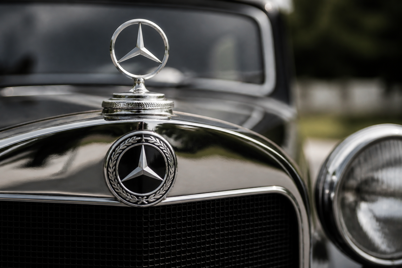
After the 1926 merger, the emblem fused the Daimler three-pointed star with the Benz laurel wreath inside a circular form, adding Mercedes-Benz lettering to complete the unified sign. The star remained central, the laurel framed the circle, and the Mercedes-Benz word marks were integrated within the design as part of a single, enduring emblem system.
Key takeaways
- The 1926 unification combined the Daimler star and Benz laurel into one circular emblem.
- Laurel wreath framing and the central star created a cohesive design language for Mercedes-Benz.
- Word marks “Mercedes” and “Benz” were incorporated within the emblem to signal a merged brand identity.
Overview: how a merger created a single, scalable emblem language
In 1926, Daimler-Motoren-Gesellschaft (DMG) and Benz & Cie. merged to form the modern Mercedes-Benz company. The emblem that emerged from this union did more than combine symbols; it established a design-language system that could be applied across vehicles, signage, and communications. The central idea was to preserve recognizability while signaling a unified corporate lineage: the three-pointed star (from DMG) remains at the badge’s heart, encircled and visually integrated with the laurel wreath from Benz & Cie., and the Mercedes-Benz word marks are positioned to read as a single brand name. In short, the 1926 emblem formalized a cohesive visual language rather than simply aligning two pre‑existing marks.
The Daimler contribution: the star as anchor
The three-pointed star originated with DMG and was retained as the emblem’s focal element after the merger. Its geometric clarity—three radiating points within a circle—provides an immediate cue that scales from a tiny badge on a car grille to large-format advertising. Retaining the star as the anchor helped preserve continuity for customers who had come to associate the symbol with engineering ambition and prestige. From a design system perspective, the star’s symmetry and strong silhouette offer predictable behavior when reproduced in diverse processes, from metal badges to embossed signage and digital assets.
The Benz contribution: the laurel wreath as enclosure and prestige cue
The laurel wreath—drawn from Benz & Cie.—functions both as a formal enclosure and as a heritage cue. Its circular, organic lines contrast with the star’s angular geometry, providing proportional balance within the overall mark. The wreath signals heritage, longevity, and a heraldic authority that complements the star’s technical connotation. In the unified emblem, the laurel also subtly links the two former brands, suggesting a single, ceremonial frame around the central symbol rather than a mere juxtaposition of two marks. Variations in the wreath’s thickness and curvature over time reflect manufacturing constraints and the evolution of branding guidelines, not a shift in the unification concept.
The word marks: integrating the names within a single system
Typography was deliberately integrated into the emblem so the viewer reads a cohesive Mercedes-Benz name rather than separate identifiers for Daimler and Benz. The arrangement places the words within the circular form alongside the star and laurel, creating a readable hierarchy that reinforces the merged identity. Over the decades, tweaks to letterforms, spacing, and tracking were made to improve legibility across sizes and media, but the principle remained: Mercedes and Benz are presented as a single brand name within one badge.
Design-language unification: reading the emblem as a system
The 1926 emblem is best understood as a modular design language—one that can be reproduced consistently on different substrates and scales. The circular enclosure serves as a universal container for a shared identity, while the star and laurel encode the brand’s dual heritage. The typography embedded within the circle anchors the viewer to the combined nomenclature. This approach allowed the emblem to function across vehicle badges, showroom signage, print advertising, and later digital representations while preserving a recognizable core that signals a merged corporate lineage.
Key timeline touchpoints shaping the final emblem
- 1925 — Early concept work consolidates the star and laurel into a unified signet concept, setting the stage for merger-era branding decisions.
- 1926 — The merger is reflected in an official emblem where the star remains central, the laurel surrounds it, and the Mercedes-Benz word marks are integrated within the circle. This marks the formal adoption of the unified design language.
- Post-1926 — The emblem becomes the enduring visual language for Mercedes-Benz, embedded in vehicles, showrooms, advertising, and corporate communications, with refinements to typography and balance as branding guidelines evolved.
Practical considerations for identifying the emblem across eras
Readers should note that vintage and contemporary badges differ in line weight, circle geometry, and typography due to era-specific manufacturing methods and media. The guiding design logic remains: star in a circular frame, surrounded by the laurel, with integrated “Mercedes” and “Benz” word marks. When comparing examples from different periods, consider:
- The relative thickness of the circle and the stroke weight of the laurel.
- The proportion of the laurel to the central negative space around the star.
- The typography’s weight, tracking, and its placement relative to the star and laurel.
Subtle changes reflect evolution in production techniques, material affordances, and how media generations interpret the badge, not a shift away from the unified design concept.
Limitations and caveats in interpreting the emblem’s origin
Although there is a clear narrative of unification, exact typographic treatments, precise geometry, and element stacking were influenced by leadership, legal considerations, and production capabilities at different moments in Mercedes-Benz’s history. Some sources emphasize the star’s centrality; others highlight the enclosing role of the laurel. For period-accurate details—especially regarding specific models or regional trademark registrations—consult primary heritage documents from Mercedes-Benz Group Tradition and related Daimler Truck materials. The emblem has persisted since 1926, but its iterations reflect ongoing branding updates rather than a break with the foundational design language.
Source-backed context and where to read more
For a structured, source-supported account of the emblem’s unification, refer to Mercedes-Benz tradition pages that discuss the emblem’s birth and milestone anniversaries. The Daimler Truck materials offer a complementary view within the broader context of the brand’s historical design language. These documents frame the 1926 emblem as a deliberate, long‑lived branding system rather than a static badge, illustrating how the emblem was conceived to endure across decades of products and markets.
Mercedes-Benz birth and emblem unification
100 years of the Mercedes-Benz brand emblem
Love at first sight: the Mercedes-Benz bus design
Notes on interpretation
This account foregrounds a design-historian’s reading grounded in verified company sources. It traces a logical path from two distinct marks to a single emblem, while acknowledging that minor variations appeared over time due to production realities and archival limitations. It is intended to illuminate the unification concept and its practical consequences for branding across eras.